
WEBPAGE TEMPLATE REDESIGN
Product pages that work for multiple audiences
Redesigning Advisory Board's healthcare data tool landing pages to convert new members and help existing users maximize their memberships.
Client
Advisory Board
Category
Healthcare
Role
Experience Strategist
Year
2025
Overview
Advisory Board sells research memberships that give healthcare organizations access to data tools for market research and planning. Their product pages weren't showcasing the value — risking low engagement and member drop-off.
The challenge
The healthcare data tool product pages had two main audiences - prospective tool users and experienced tool users.
For the prospective tool users, which could be either new Advisory Board members or prospective members, the pages provided little to no information on the tools or the value of an Advisory Board membership.
For the experience tool users, the authenticated view of these pages explained how to use the tools before answering the only question that mattered: What can this tool do for me and my business?

My role & approach
As Experience Strategist, I conducted a heuristic evaluation on the current site, competitive analysis against direct and indirect competitors, and took into account the findings from our stakeholder and user interviews. The team then tested and iterated on our design solution against the following three principles:
01
Balance novice & expert needs
A true marketing page that still lets power users jump straight to the tool.
02
Promote tools & foster trust
Surface data freshness, sources, and methodology up front.
03
Improve visibility
Clear value propositions and semantic structure for SEO and AI search.
What changed
Four moves that reshaped the page
Lead with “why,” then “how”
Reframed the tool overview around the questions users actually want answered.
Bring methodology & data freshness higher
The number-one reason users opened the FAQ was for the methodology — so we moved it higher up the page.
Make navigation obvious
A persistent “jump to” menu allows experienced users to quickly find what they need while letting novice users know what they can expect to find on the page.
Simplified tool graphics
I designed custom pared down versions of the tool interface, shown with callouts pointing to the key features of each tool.
Final designs
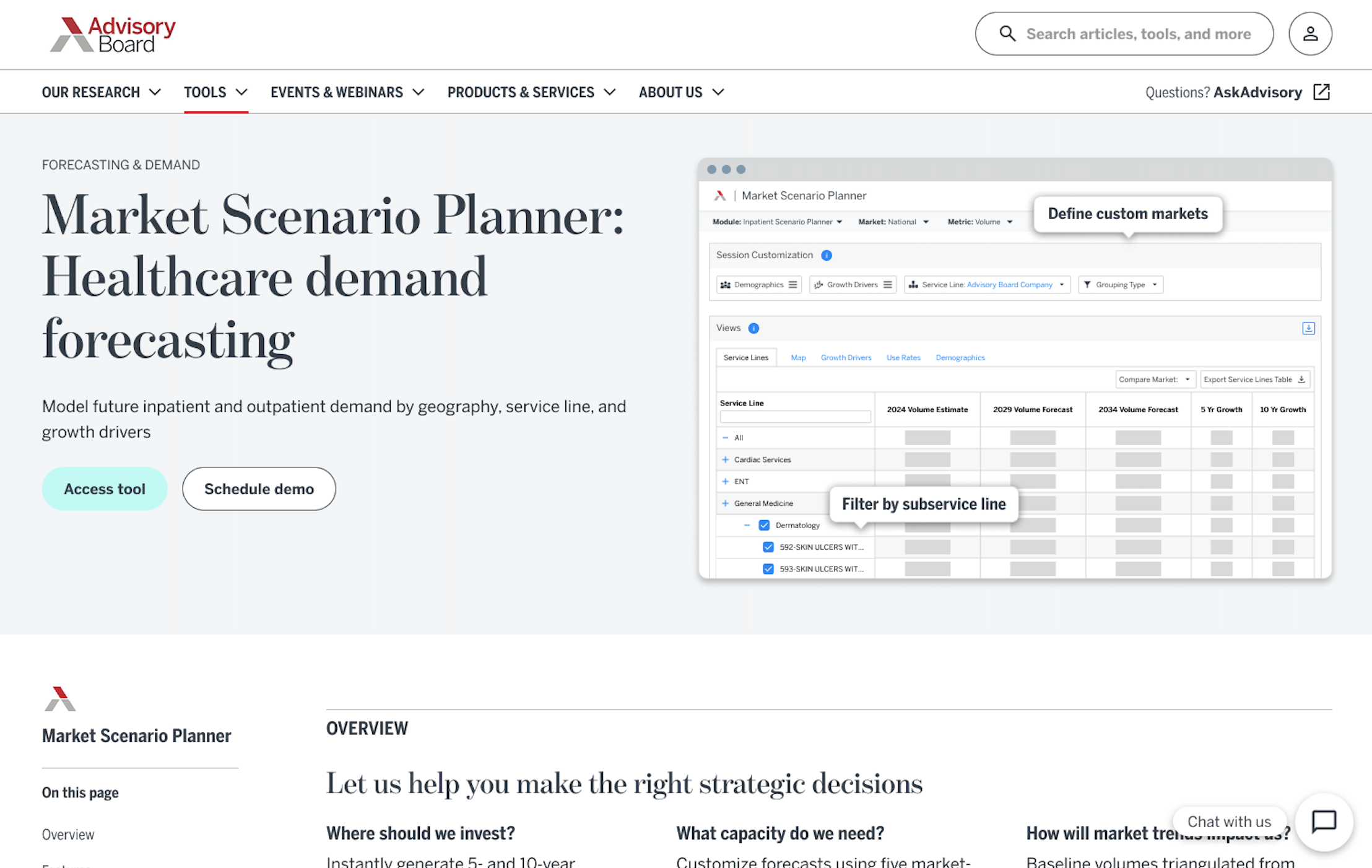
Value proposition and CTA visible above the fold

Data transparency fields users explicitly asked for

Use case examples and FAQs embedded on the page

Bulleted summaries of tutorial videos + contact us form
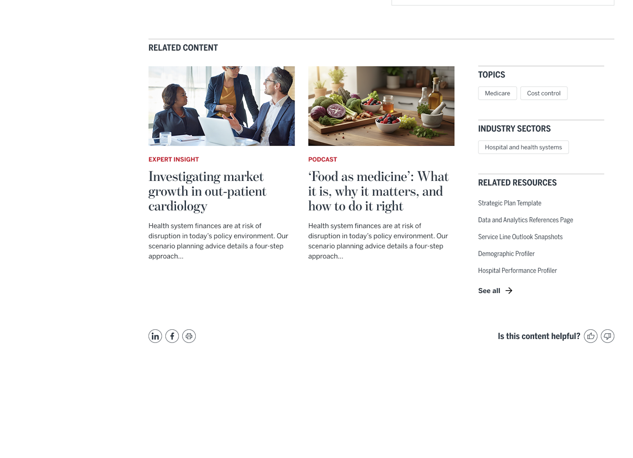
Related content, resources, and tools
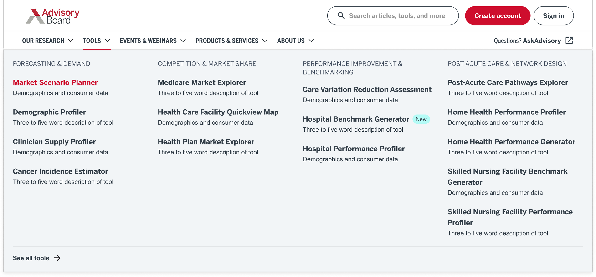
Tools menu with added descriptions
What shipped
A templatized landing-page system applied across three flagship tools
SEO and AI-search recommendations
A prioritized roadmap for the rebuild